Black Lagoon
The Company Of Seafood
The Company Of Seafood
-
ClientBlack Lagoon
-
IndustrySeafood
-
Skills01.Branding02.Packaging Design03.Visualization04.UI/UX
-
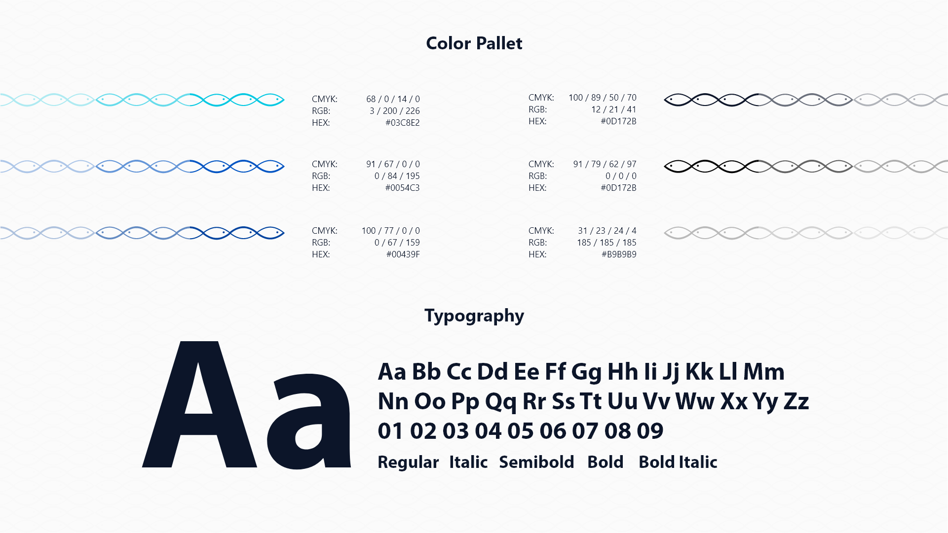
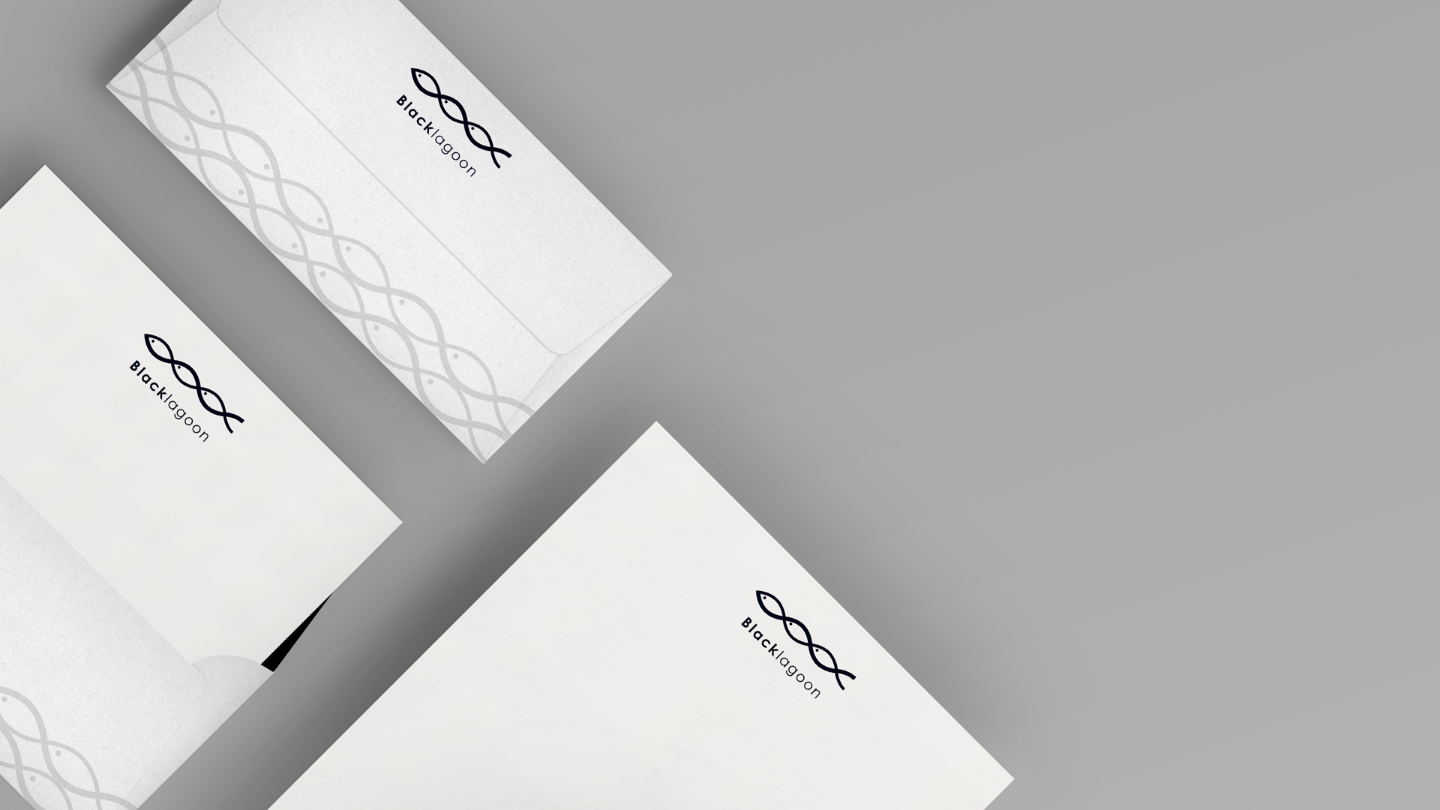
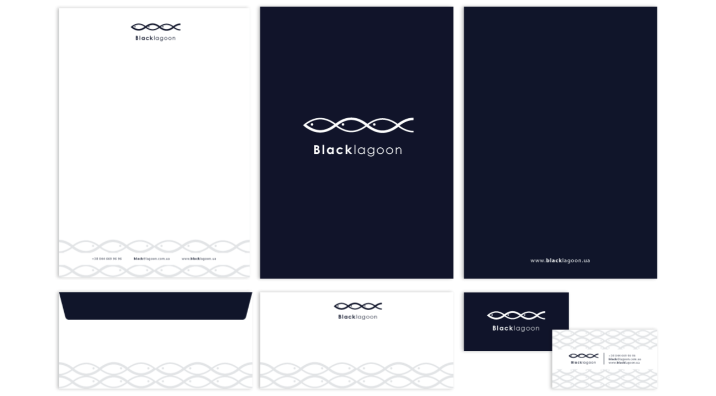
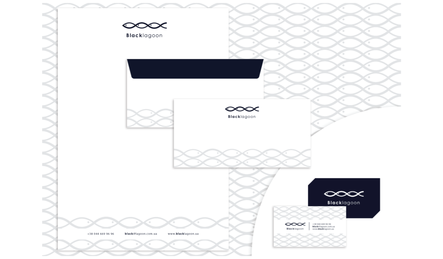
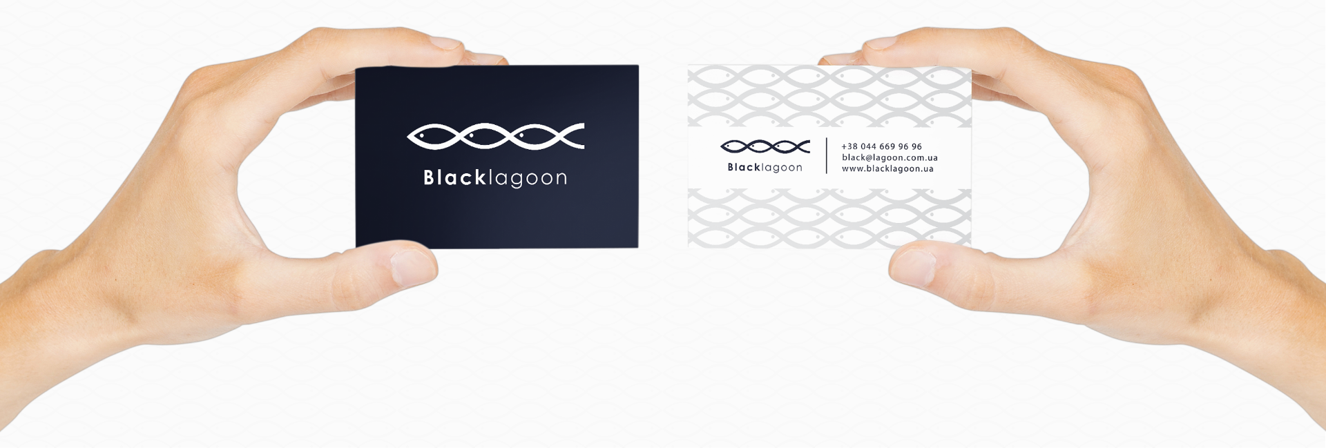
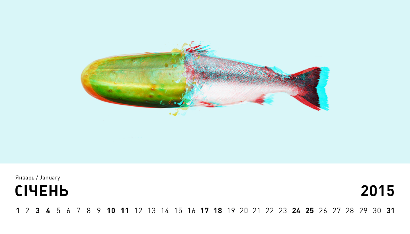
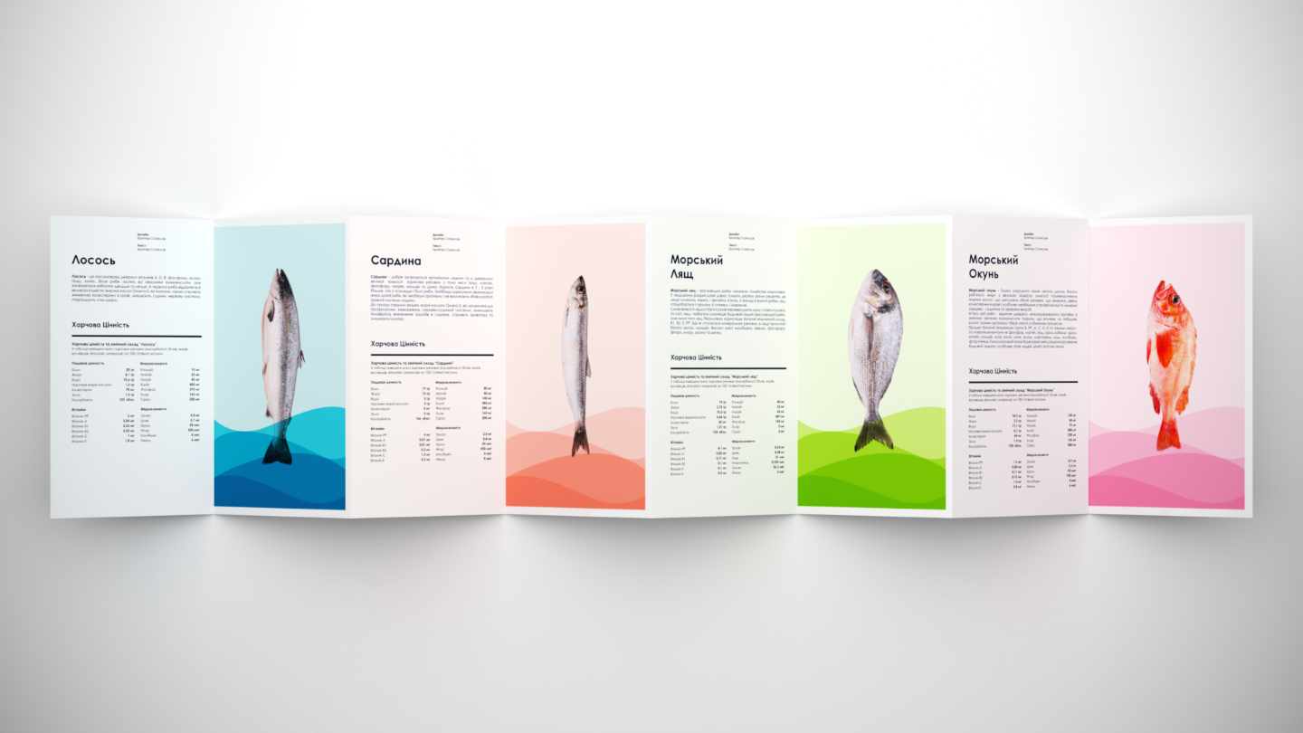
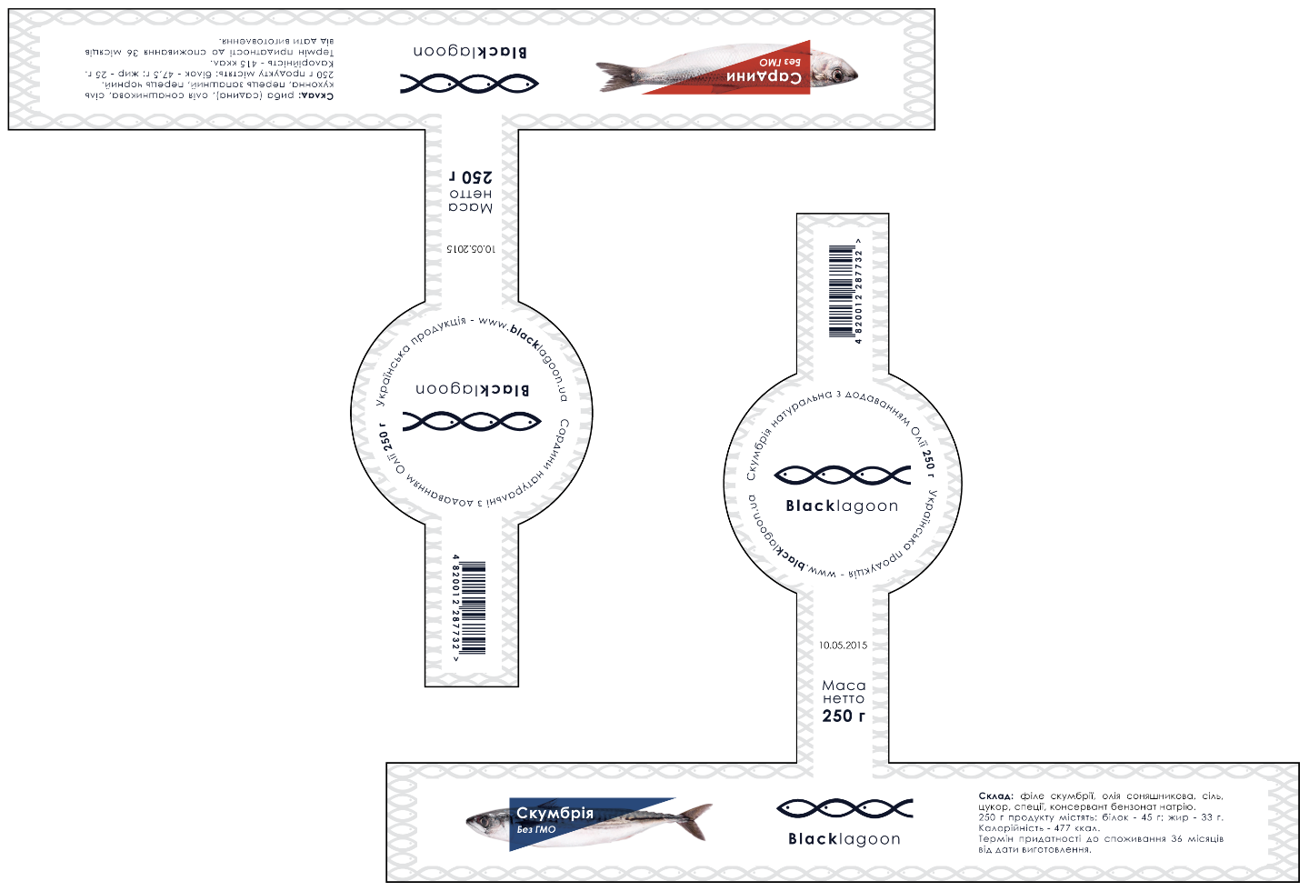
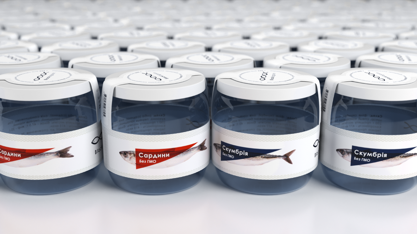
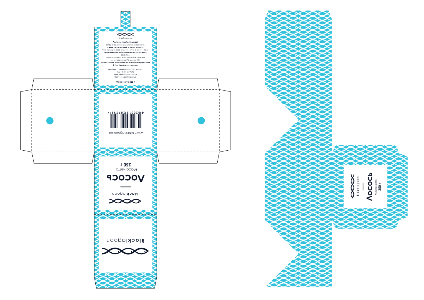
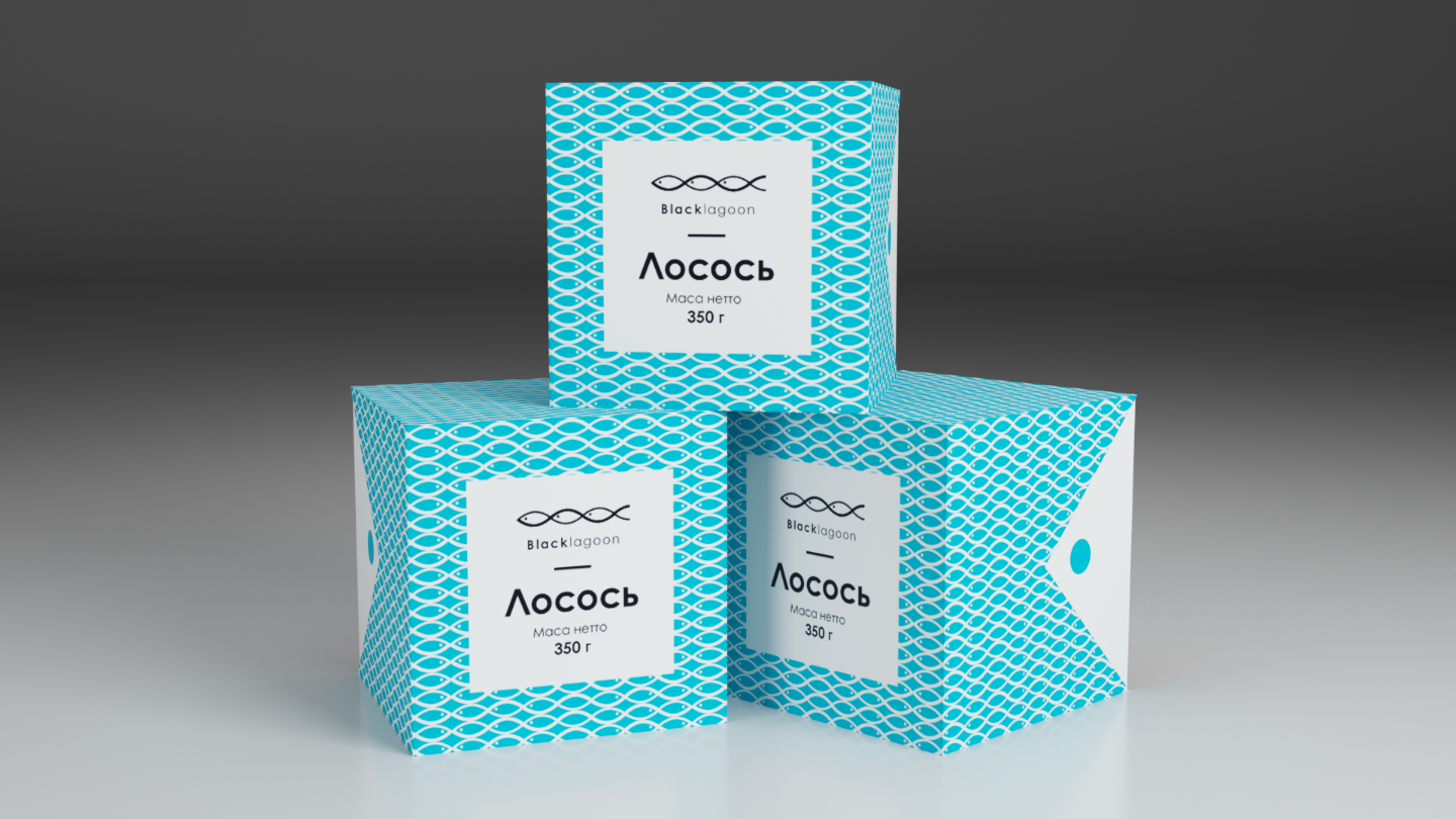
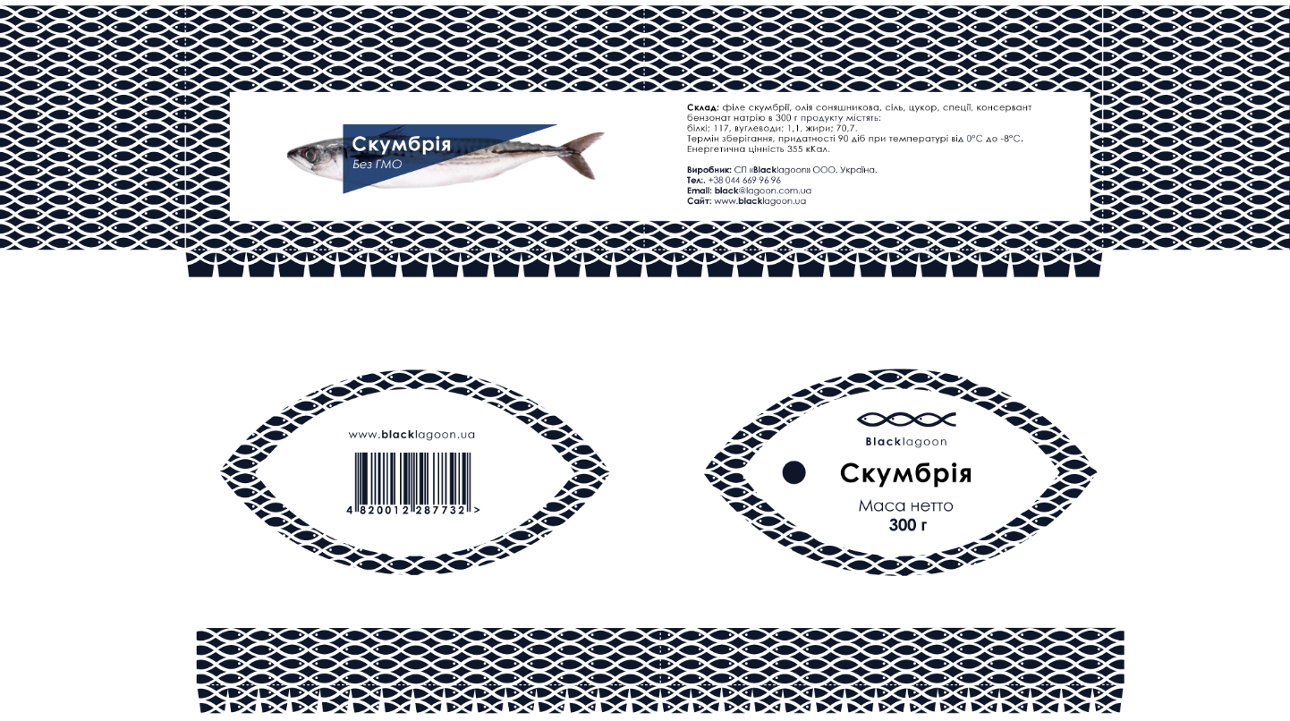
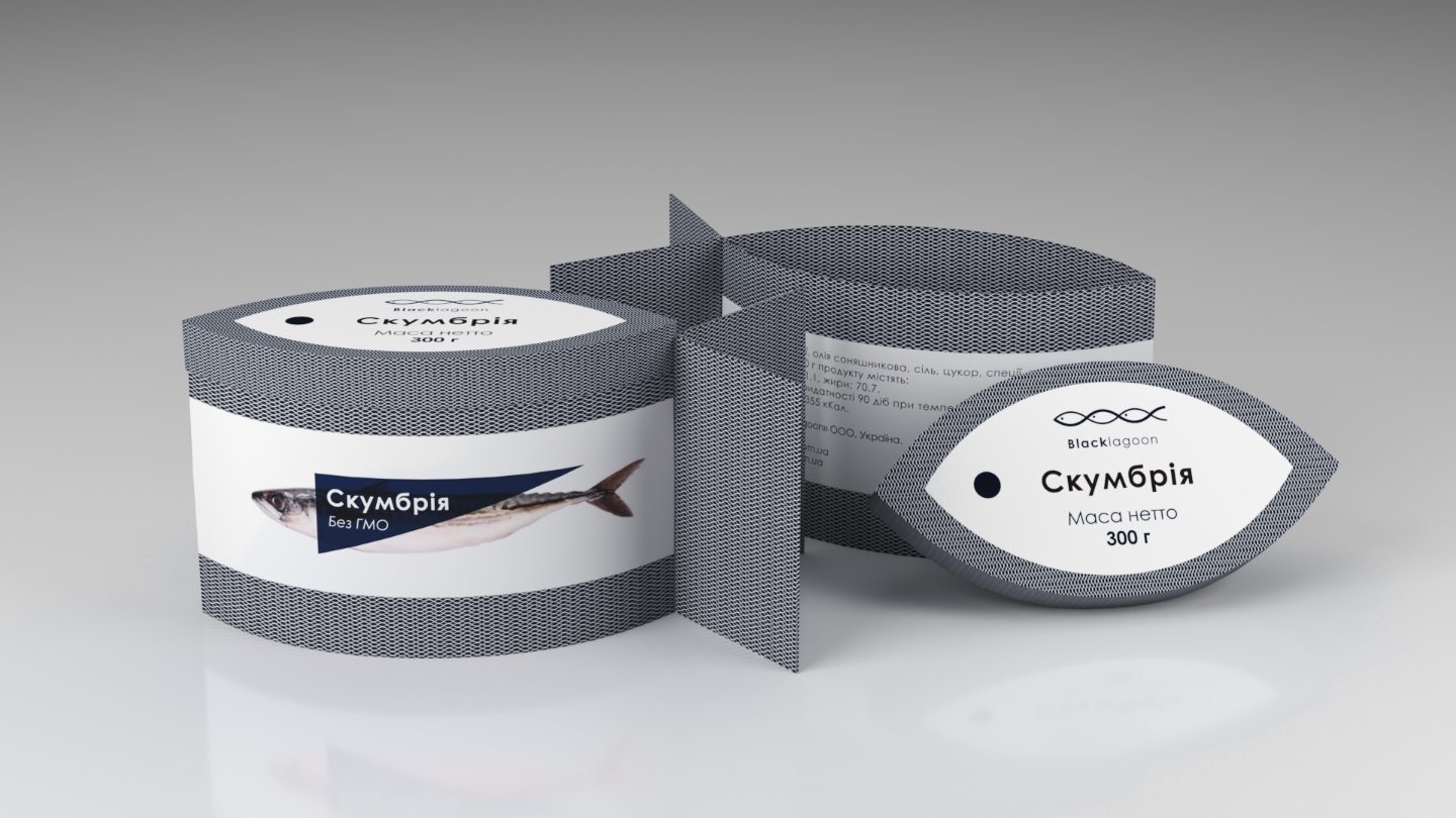
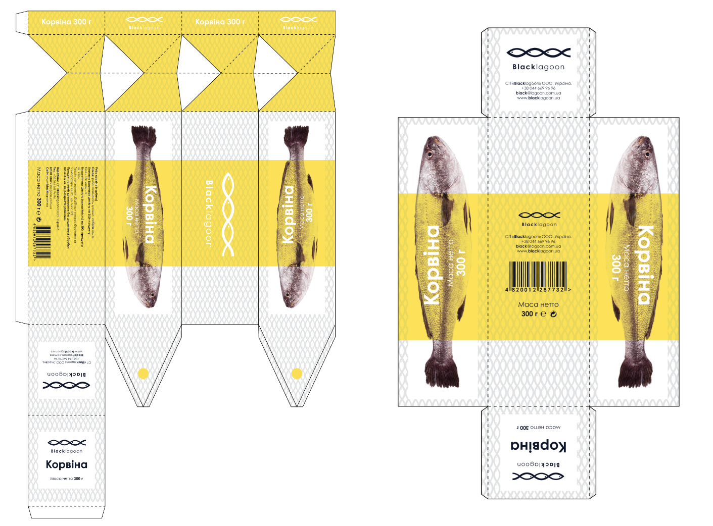
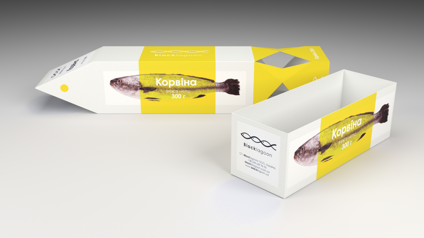
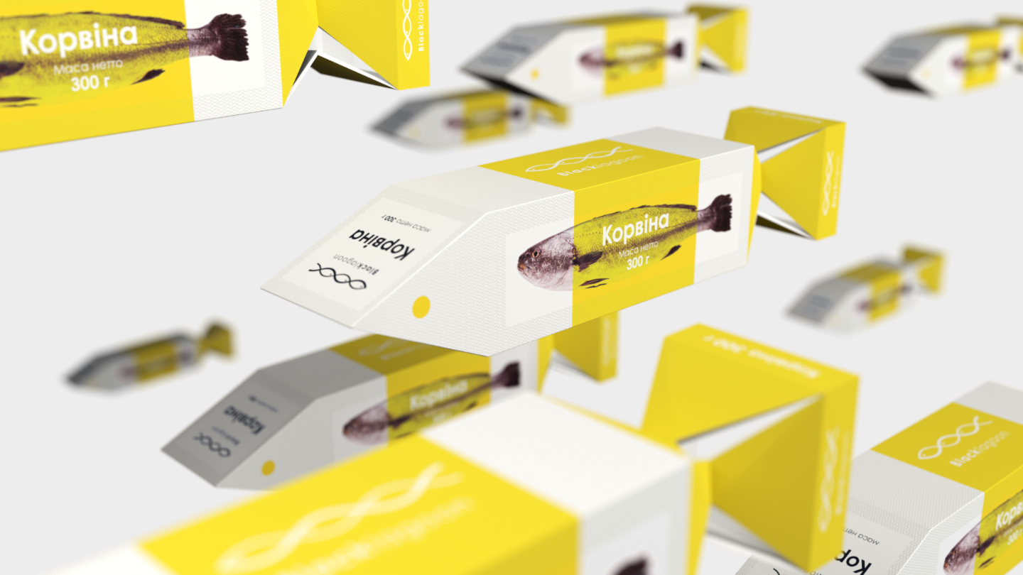
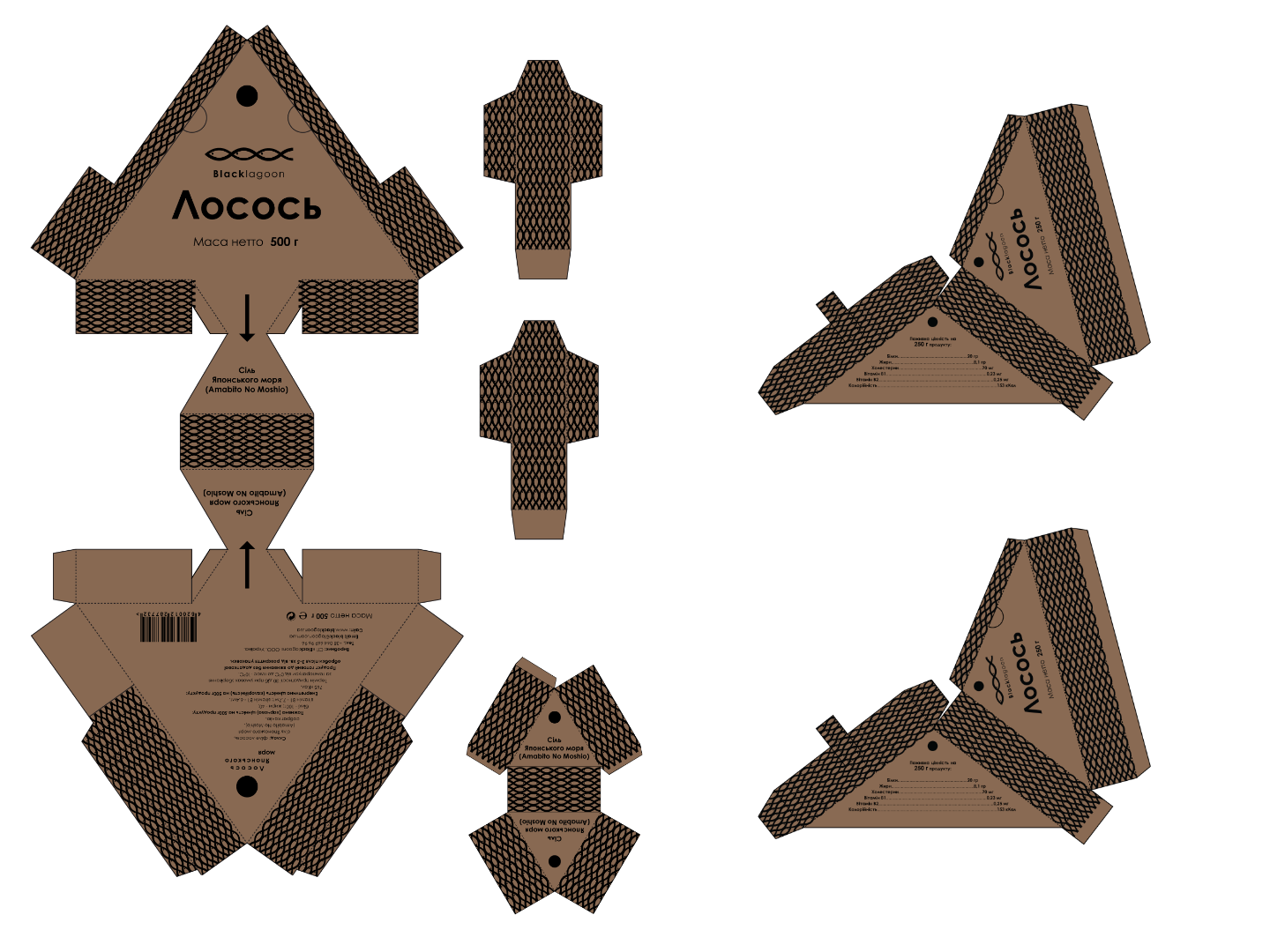
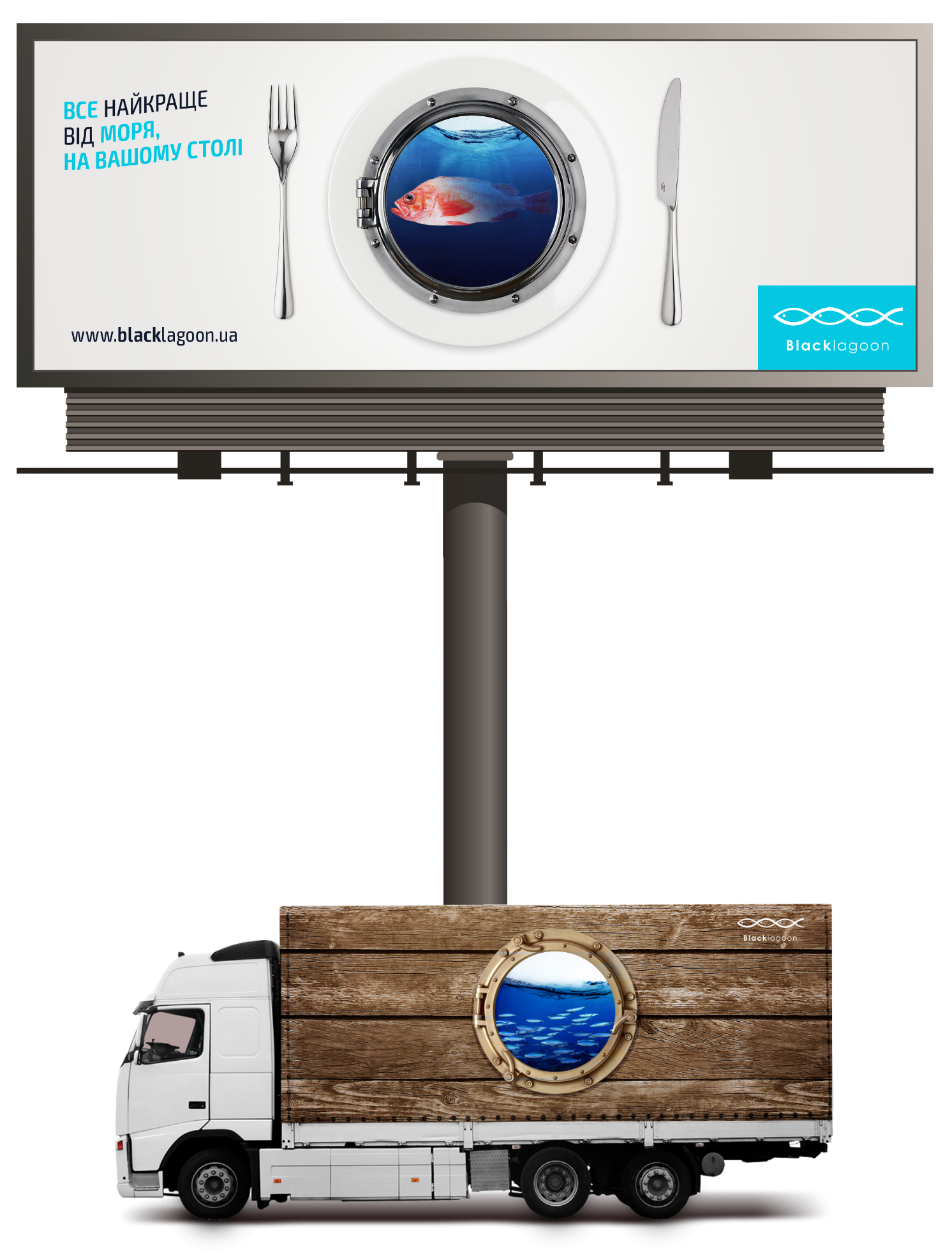
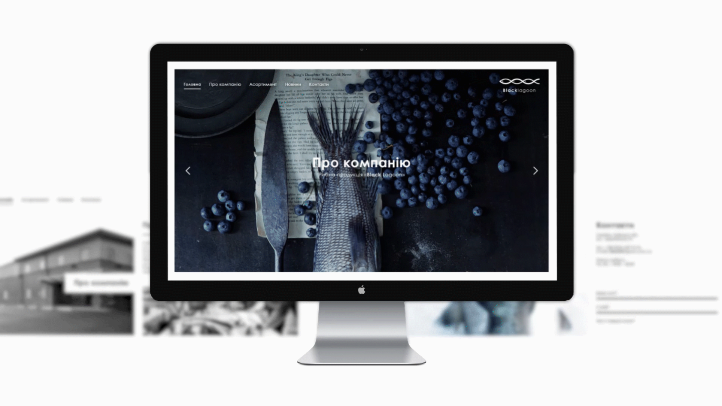
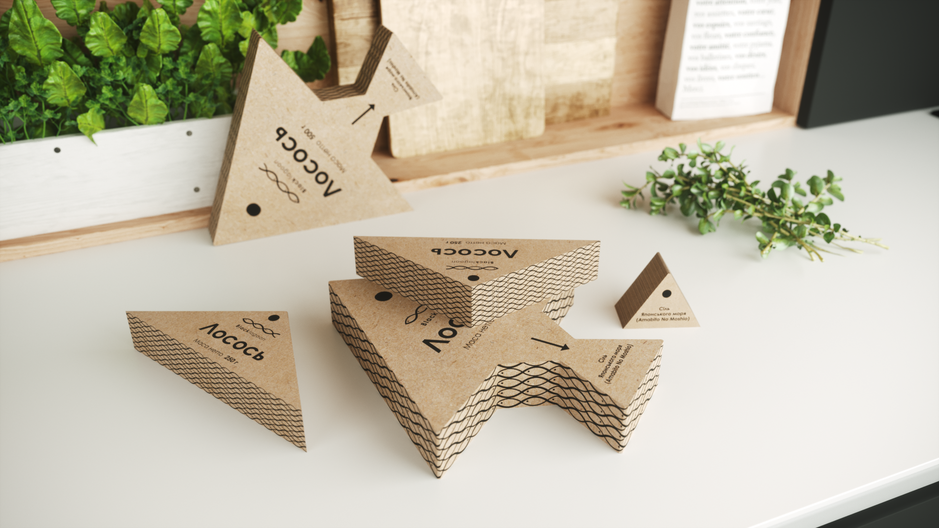
"Black lagoon"Corporate style has been developed for the Black Lagoon project. It includes logo + naming, basic graphic constants, business documentation, souvenir and promotional products, creative packaging and label design. The name takes after the activity of the company. "Lagoon" is a reservoir separated from the sea by oblique sand. There are a lot of species of fish there, so this is the best place for fishing. Why "Black Lagoon"? Because it sounds intriguing, and deep-water areas are intriguing as well. It happens because of the amount of sea inhabitants living there — much more than in shallow water. The unicity of the sign is that by using only the interwoven lines and several points a stylized flock of 3 fish is immediately visible.
-